Early Start Art
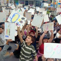
Last Friday, I taught art at my daughter’s school. I had the entire 2nd grade – some 80 students at once. They piled on the floor with clipboards eager to create their own masterpiece. Art is not offered until 3rd grade and I volunteered because I believe art is fundamental in early education.
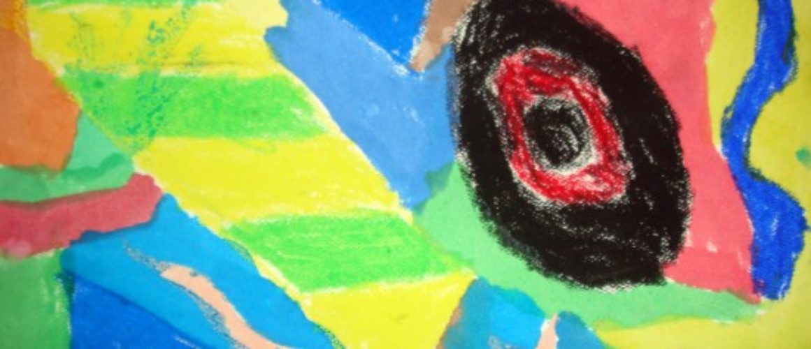
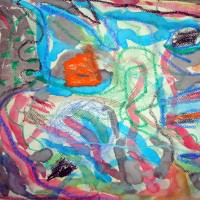
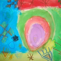
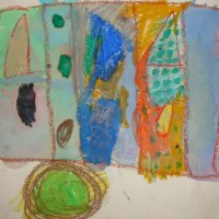
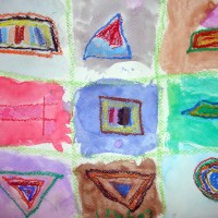
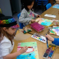
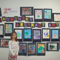
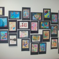
I showed them references to Kandinsky’s art as well as talk a bit about abstract art. I also showed the kids a jar filled with water and oil to demonstrate how the 2 substances never mix. Oil crayons and textured paper were passed out and the instruction was to draw anything “not real.” Then the classes separated back to their home rooms to do the “resist” with water color over the oil crayon. It’s really amazing to see the art from the kids. Next week I will make a mural of all the kids “Kandinsky” inspired art to hang in their cafeteria. Below is my lesson plan.
Lesson Plan
Artist: KANDINSKY
Style: Abstract
Discipline: Science
Medium: Mixed / Resist
Materials:
Oil Crayons
Paper
Water color paint
Paint brush
Water cups
Towels
Demo/Intro
Show the oil and water with food coloring in a jar. Shake it up and explain oil and water do not mix. Their chemical make up is different. Oil forms circular droplets within the water. It floats because its density is less than that of water.
Next, Talk about the artist.
What type of art did Wassily Kandinsky do? Abstract art.
Why did he make abstract art? He found that paintings can be more beautiful without a realistic subject.
Bright colours on a dark background reflected in much of his early work.
He started painting at the age of 30.
The demo / intro is brief and direct so the kids have time to actually make art and can remember some basic facts.
What You Do
Draw a design or picture with crayons. Light colors work the best but the kids can experiment.
Make sure to press hard with the crayons so they show up under the paint.
When you finish your drawing, lightly brush paint over the picture. The areas of crayon will resist the paint.Let the kids enjoy the medium. Shapes do not need to be perfect: in fact, squarish, crooked and off-centre look better than perfect.
